Overview
As mentioned in other sections of this document, ZenCrepes has been built to be Data-Centric. Each of the different tabs will present data as it is, with as little pre-made interpretation or assumptions as possible.
ZenCrepes presents facts, and it's up to the viewer to determine which course of actions to take with those factual elements (although of course, implementation might introduce bias).
If you're curious to understand the thought process that went into creating ZenCrepes, you can take a look at the following articles I've written while creating ZenCrepes:
- Understand velocity and forecast with JIRA Agile
- Agile in research - Another take on metrics and estimates
- Introducing ZenCrepes - Agile analytics across GitHub orgs & repos
- Data-driven Agile is the answer to all our problems!
User Interface

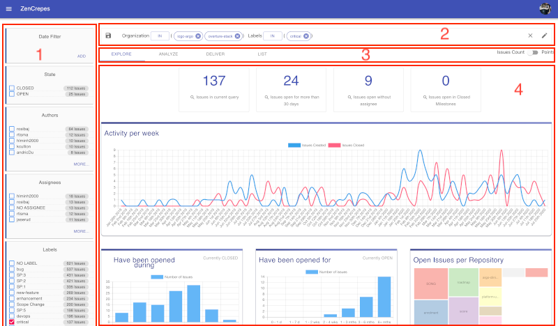
Each dataset is presented in a very similar fashion and contain:
- (1): Facets to easily click to filter the dataset and show number of elements for each of the aggregations
- (2): A query, displaying the current filters being applied. Queries can be edited and/or saved for later use
- (3): Navigation tabs to dive in the data through different angles
- (4): The actual data window.
Click to filter
Most elements should be clickable and let the user narrow the dataset.